水平居中对齐
方案一
只能用于块元素 水平居中对齐。
子元素指定 width,同时将 margin-left 和 margin-right 设置成 auto;
缺点是 只能做到水平居中对齐,不能竖直居中对齐,比如设置 margin: auto; 和设置 margin-left:auto; margin-right:auto; 效果相同
http://editor.ruosen.io/?id=62b19aa7fed123ba66c6be3af7cae1ce
1
2
3
4
5
6
7
8
9
10
11
12
13
14
| <div class="father">
<div class="child">你好</div>
</div>
.father {
background-color: red;
height: 50px;
.child {
background-color: green;
width: 200px;
margin: auto;
}
}
|
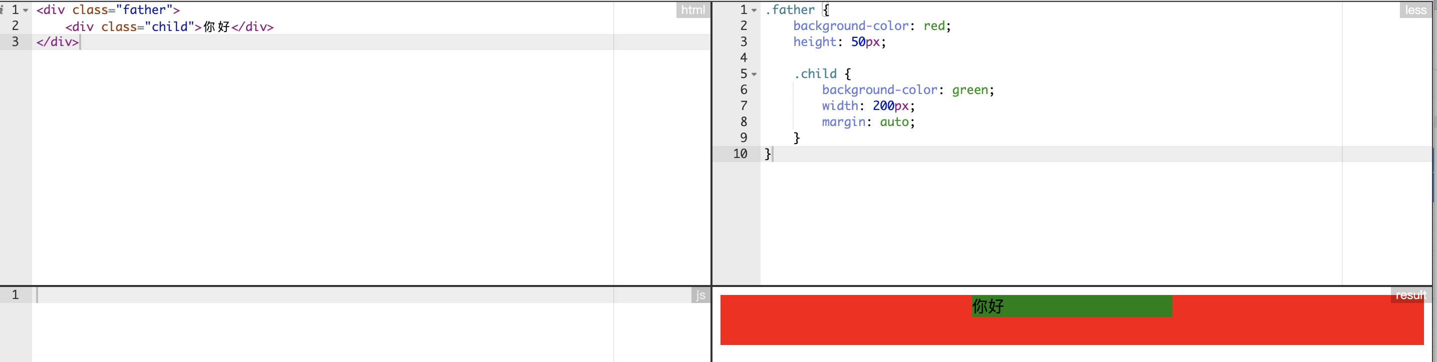
方案二
只能用于行内元素水平居中对齐。
利用父元素的 text-align: center 属性来实现。
该方式对图片或其它行内元素都起作用。
http://editor.ruosen.io/?id=ffbf1e3befaa3bd7a0d5ed05f9794d44
1
2
3
4
5
6
7
8
9
10
| <div class="container">
<img style="width: 100px; height: 100px;" src="http://www.tuqinghua.com/d/file/p/2019/08-06/24fadf0d7f8c2d6448ddc52bf5a5409c.jpg">
</div>
.container {
width: 300px;
height: 300px;
background: red;
text-align: center;
}
|
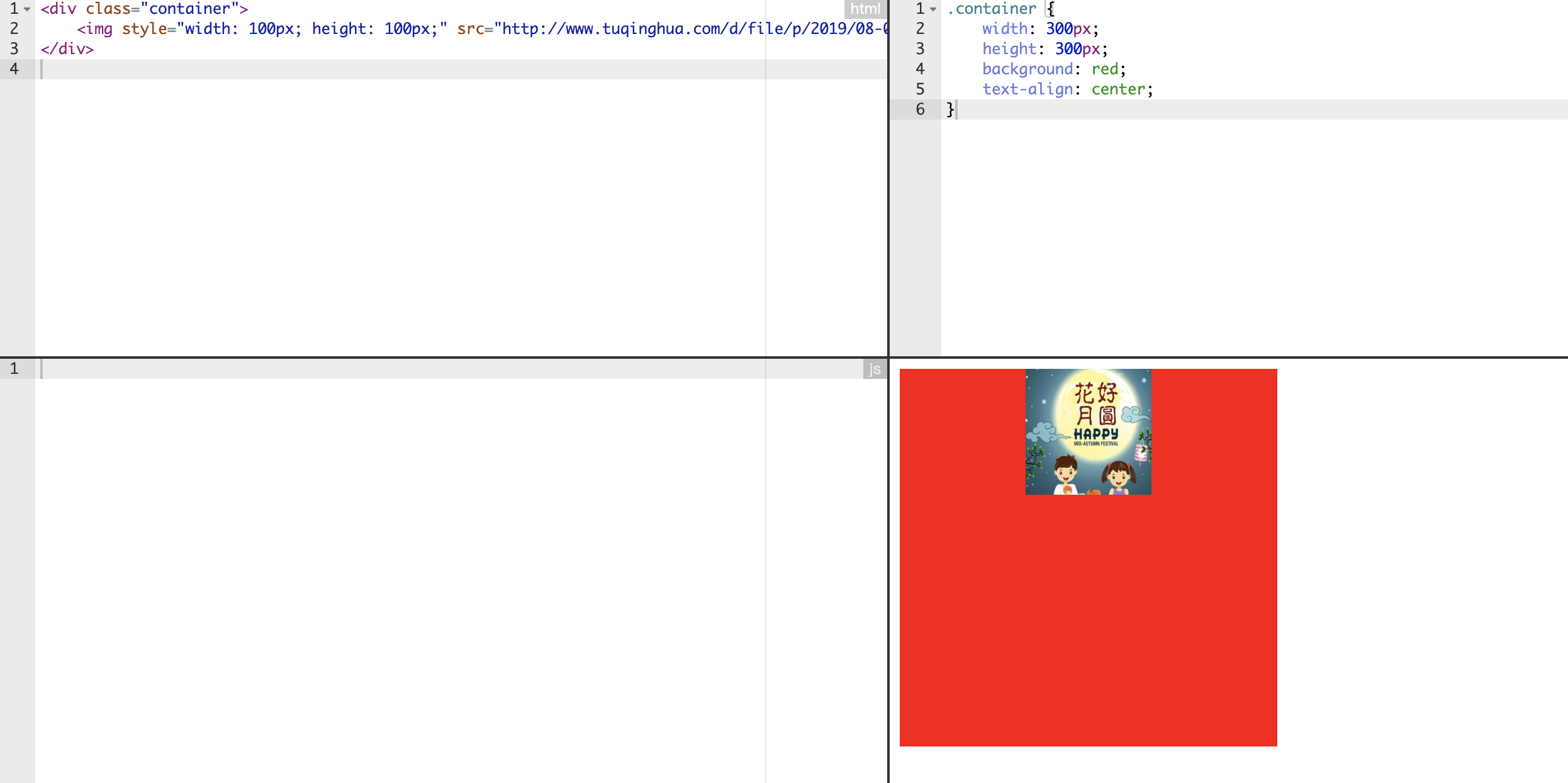
水平垂直同时居中对齐
方案一
同时适用块元素和行内元素实现水平和垂直方向同时居中对齐。
利用 transform 实现。
http://editor.ruosen.io/?id=26c3aa622708de627eb694108b733939
1
2
3
4
5
6
7
8
9
10
11
12
13
14
15
16
17
18
19
20
21
22
23
24
25
26
27
28
29
| <div class="father">
<div class="child">你好</div>
</div>
<div class="father father2">
<img class="child" src="https://ss1.bdstatic.com/70cFvXSh_Q1YnxGkpoWK1HF6hhy/it/u=2692023635,939588326&fm=26&gp=0.jpg" />
</div>
.father {
background-color: red;
position: relative;
height: 100px;
.child {
background-color: green;
position: absolute;
top: 50%;
left: 50%;
transform: translate(-50%, -50%);
}
}
.father2 {
background: black;
img {
width: 50px;
height: 50px;
}
}
|
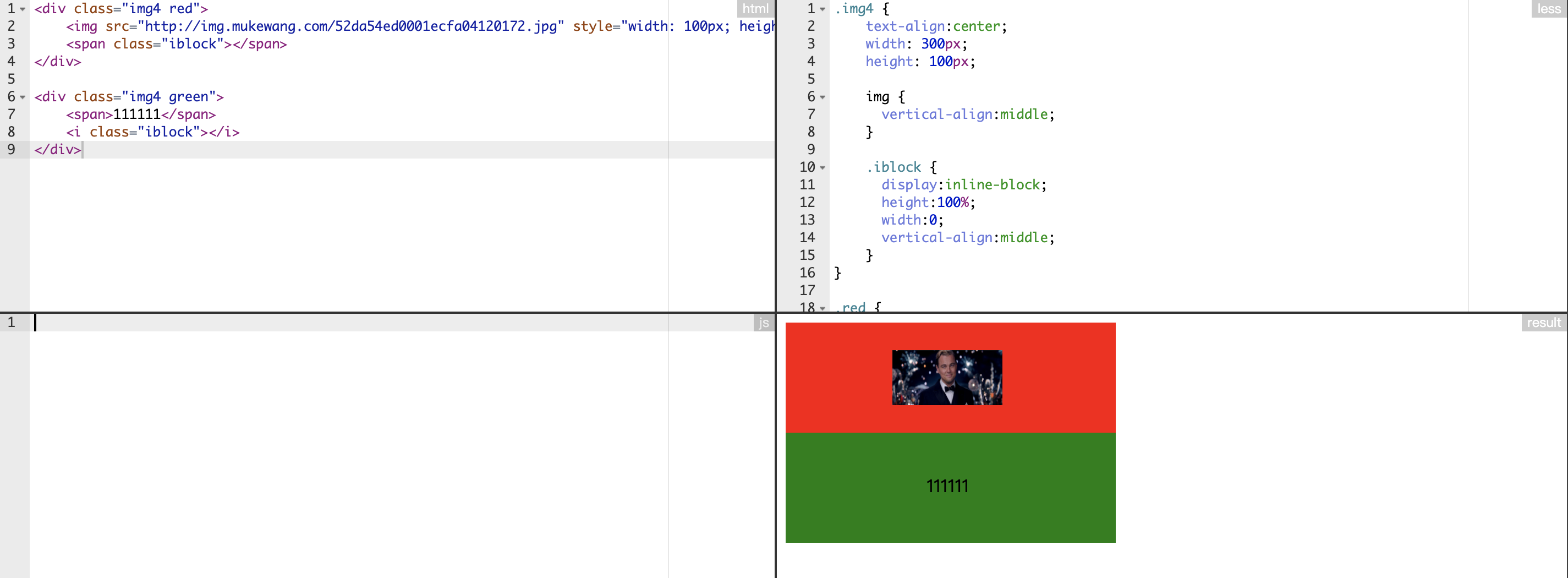
方案二
同时适用块元素和行内元素实现水平和垂直方向同时居中对齐。
利用增加一个高度为 0 的空白标签来实现。
http://editor.ruosen.io/?id=3c2f0840c7fdab40b48438d441228b2d
1
2
3
4
5
6
7
8
9
10
11
12
13
14
15
16
17
18
19
20
21
22
23
24
25
26
27
28
29
30
31
32
33
34
| <div class="img4 red">
<img src="http://img.mukewang.com/52da54ed0001ecfa04120172.jpg" style="width: 100px; height: 50px" />
<span class="iblock"></span>
</div>
<div class="img4 green">
<span>111111</span>
<i class="iblock"></i>
</div>
.img4 {
text-align:center;
width: 300px;
height: 100px;
img {
vertical-align:middle;
}
.iblock {
display:inline-block;
height:100%;
width:0;
vertical-align:middle;
}
}
.red {
background: red;
}
.green {
background: green;
}
|
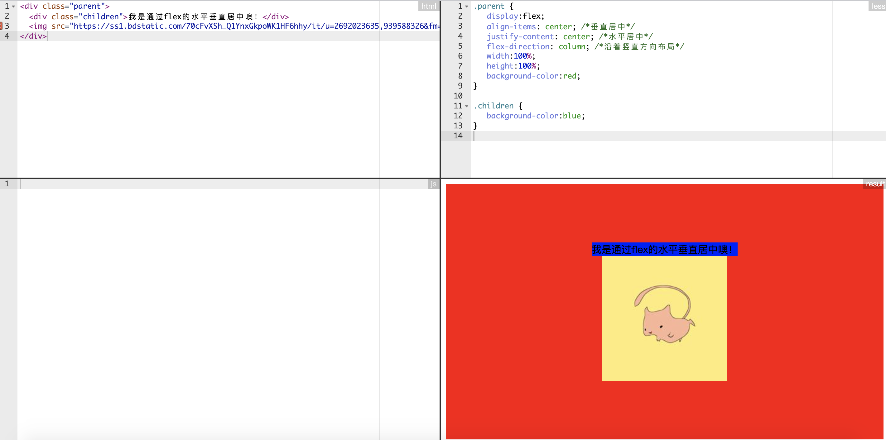
方案三
同时适用块元素和行内元素实现水平和垂直方向同时居中对齐。
利用 flex 布局实现
http://editor.ruosen.io/?id=b926056b95cbc83288bbd74f8bb3b5f9
1
2
3
4
5
6
7
8
9
10
11
12
13
14
15
16
17
18
| <div class="parent">
<div class="children">我是通过flex的水平垂直居中噢!</div>
<img src="https://ss1.bdstatic.com/70cFvXSh_Q1YnxGkpoWK1HF6hhy/it/u=2692023635,939588326&fm=26&gp=0.jpg" />
</div>
.parent {
display:flex;
align-items: center; /*垂直居中*/
justify-content: center; /*水平居中*/
flex-direction: column; /*沿着竖直方向布局*/
width:100%;
height:100%;
background-color:red;
}
.children {
background-color:blue;
}
|
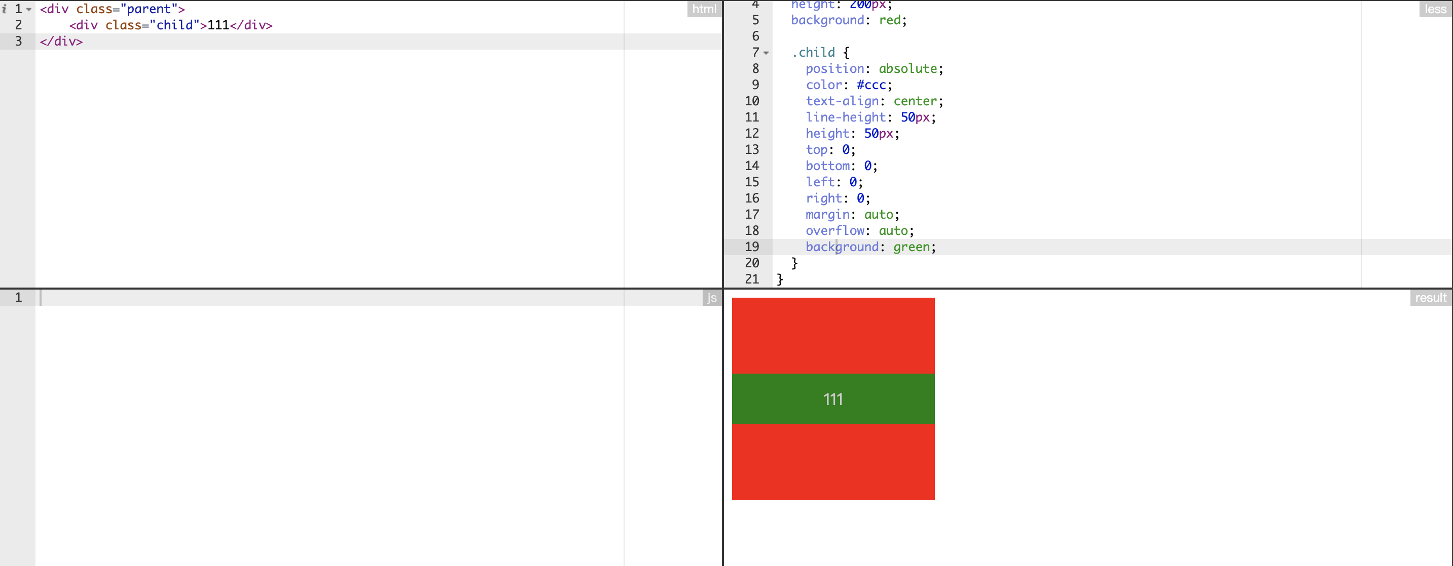
方案四
文本元素的水平和垂直居中对齐。
利用绝对布局实现。
http://editor.ruosen.io/?id=35056417c445656f8caad68a1109acab
1
2
3
4
5
6
7
8
9
10
11
12
13
14
15
16
17
18
19
20
21
22
23
24
25
| <div class="parent">
<div class="child">111</div>
</div>
.parent {
position: relative;
width: 200px;
height: 200px;
background: red;
.child {
position: absolute;
color: #ccc;
text-align: center;
line-height: 50px;
height: 50px;
top: 0;
bottom: 0;
left: 0;
right: 0;
margin: auto;
overflow: auto;
background: green;
}
}
|